Dashboards are dynamic and customizable dashboards that allow you to easily and graphically display your organization's sensor data in a single view as you wish.
The following sections explain how to create dashboards and how to create and configure all kinds of widgets:
Creating/managing dashboards
Add widgets
Widget: Numeric Value
Widget: Line Chart
Widget: Bar Chart
Widget: Indicator
Widget: Area Chart
Widget: Level indicator
Widget: Line plot with calculated series
Widget: ON/OFF signal
Widget: KPIs
Widget: Text
Widget: Expert knowledge
Widget: Value and direction
Widget: Sensor map with expert knowledge
Move/edit/delete widgets
Creating/managing dashboards
To create a new dashboard you must first go to the left side navigation menu and select the option "My panel". Below it will open a section where "Settings" and the names of the dashboards you have created will appear. To create a dashboard, click on "Settings". The order of the process can be seen in the following image:
Once you click on "Settings" opens the view that allows you to create a new dashboard, edit existing dashboards and delete a dashboard.
To create a new dashboard you just have to click on the "Create new dashboard" button. A dialog will be displayed that will allow you to give it a name, specify its visibility and the frequency of data refresh. To edit a dashboard you just have to click on the pencil of the corresponding table.
You can edit both its name and its visibility as well as the frequency of updating the data.
Regarding the types of visibility:
You can configure the dashboard to be only visible to you: that is, no one else, not even other users in your organization will be able to view the dashboard.
It can be configured to be visible to your entire organization: in this case, other users in your organization will be able to view the dashboard, but they won't be able to edit it or make changes to the dashboard.
It can be configured to be visible only to users of certain networks, that is, only to users who have privileges on the selected networks.
In order to delete a dashboard, you just have to click on the trash can of the corresponding table.
In order to access our new dashboard we just have to click on the name. The name is a link that takes us directly to the dashboard.
Add widgets
Once we are inside a panel, the first thing we must do is create a new widget. A widget is essentially a container in which we can say that we want it to go inside (e.g., two line plots with the temperature values for two different sensors in the last 30 days). To create a new widget simply click on the "Add widget" button, as indicated in the following image:
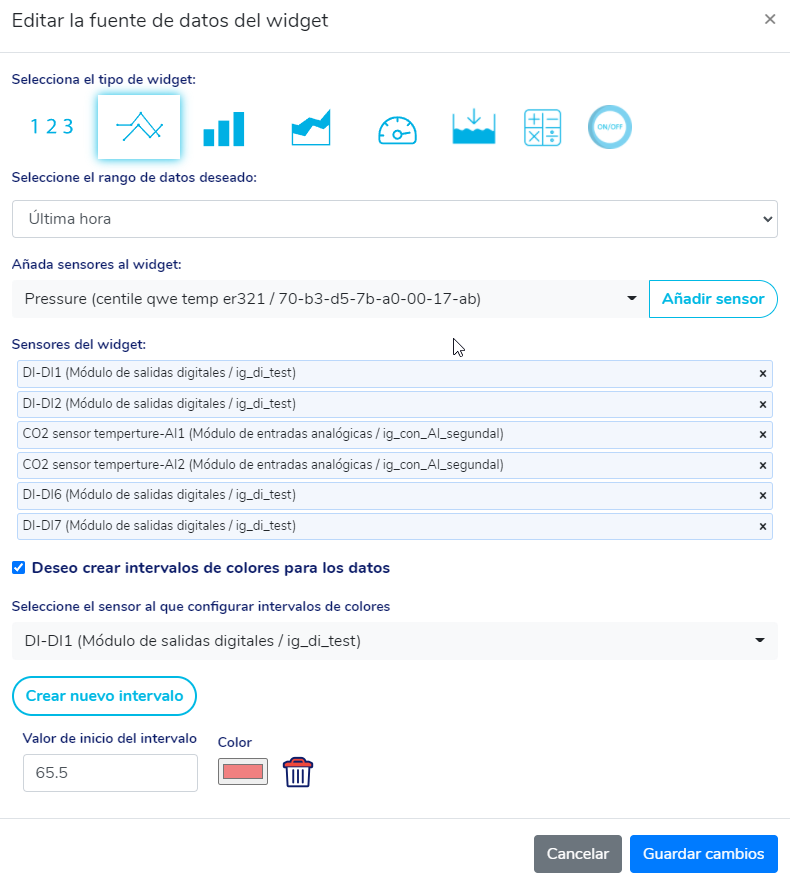
Immediately after hitting the button, a new window will open that allows us to configure what will be displayed in this new widget:
We can edit the widget type, data type, sensor and create color ranges based on data values.
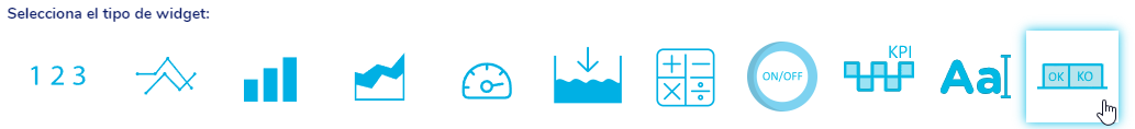
The types of widgets available, from left to right in the image above, are:
1. Numerical value
2. Line plot
3. Bar graph
4. Indicator (Gauge)
5. Area Chart
6. Level indicator
7. Line plot with calculated series
8. ON/OFF signal
Widget: Numeric Value
In widgets of type numeric value, you can display a single numeric value. This numerical value can be the last value reported by the sensor or the maximum/minimum/average/accumulated value in X days. The number of days is defined in this same window, as shown in the following image:
Widget: Line Chart
To choose the type of line chart widget, simply click on the following image:
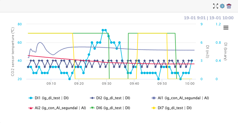
In the widgets of type graph of lines, we can choose up to 20 sensors to show in the same graph, the interval of acquisition of the data and optionally we can also define the ranges of colors for each graph.
In order to create color ranges for the graphs, you just have to click on the check "I want to create color ranges for the data", select the sensor to which you want to configure color ranges and then press the "Create new interval" button.
After clicking a row will be added in the window where we can specify a limit value from which the data will be drawn with a specific color (eg, if we are graphing the water level and we put "20" as a value and red as a color, if the water level for a specific moment of time is 21 meters, This value will be highlighted by painting in red in order to alert us of this event).
To set intervals for another sensor, simply click the sensor drop-down, select a different sensor, and add intervals for this sensor.
It is important to note that if we put 2 color intervals, these will define 3 color zones. This can be seen in the following example:
For the graph of the image above, two color ranges have been defined:
This setting makes any value below 17 blue (default color), any value between 17 and 19 orange, and any value above 19 red.
Below we can see an example of configuration for multiple graphs:
It is possible to zoom in on the graphs by clicking with the mouse and dragging to select a time interval. Once this is done, a button will appear in the upper right corner of the graph that allows you to reset the default zoom of the graph.
Widget: Bar Chart
To select the bar graph type widget you just have to click on:
In bar graph type widgets, you can set the same configuration as in line graphs, we can graph the data of up to 20 sensors at once, specify the period of time over which we want to see the data and define the color ranges. Additionally, if we choose a sensor on which the data can be accumulated, a selection box will be displayed that will allow us to accumulate the data of the sensors by hours or by days:
Below we can see an example of bar chart and its configuration:
Widget: Indicator
To display the data in an indicator (gauge) you just have to click on:
We must define the minimum and maximum values of the indicator and create color intervals.
Below we can see an example of an indicator and its configuration:
Widget: Area Chart
To display sensor data in area graphs, we must click:
Area charts have the same configuration parameters as line plots.
Below we can see an example of an area chart and its configuration:
Widget: Level indicator
The level indicator widget allows us to specify two limits, one upper and one lower and will show us a sphere with a specific level located between the two limits that will depend on the chosen sensor. This widget is ideal for representing the water level in tanks but can be used to represent any sensor value between two boundaries.
To use this type of widget we must click:
Once clicked, the sensor and the maximum and minimum values for the indicator must be selected.
Below we can see an example of an indicator and its configuration:
Widget: Line plot with calculated series
The line graph widget with calculated series allows us to establish a formula using the sensors we have and represents the result of the formula for each instantaneous value of the sensors in a line plot.
To use this type of widget we must click on:
Once the widget configuration dialog opens, we must enter in the text box "Formula of the composite data series" the formula with the sensors and the desired mathematical operations. Selecting a sensor in the sensor drop-down will add it to the formula and clicking on some operation or number on the keyboard also adds that operation/constant formula.
It is important to note that once the sensor identifiers and operations/constants have been entered, we can edit the formula text box, repositioning the sensor/operations/constant identifiers as we want to establish the formula.
Once the formula is entered, we can test its validity by pressing the "Test the validity of the formula" button.
Finally, we must also specify the data range and the type of unit resulting from the formula entered.
As in the widgets of the other graphs, we can also create color ranges.
Below we can see an example of line graph with calculated series and their configuration:
Widget: ON/OFF signal
The ON/OFF signal widget allows us to represent in a visually attractive way the state of a sensor that can only set binary values, that is, it can only return 0's or 1's.
To use this type of widget we must click on:
Once the widget configuration dialog opens, we must choose a sensor and the texts and colors for when the signal is 1 and 0 respectively:
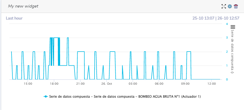
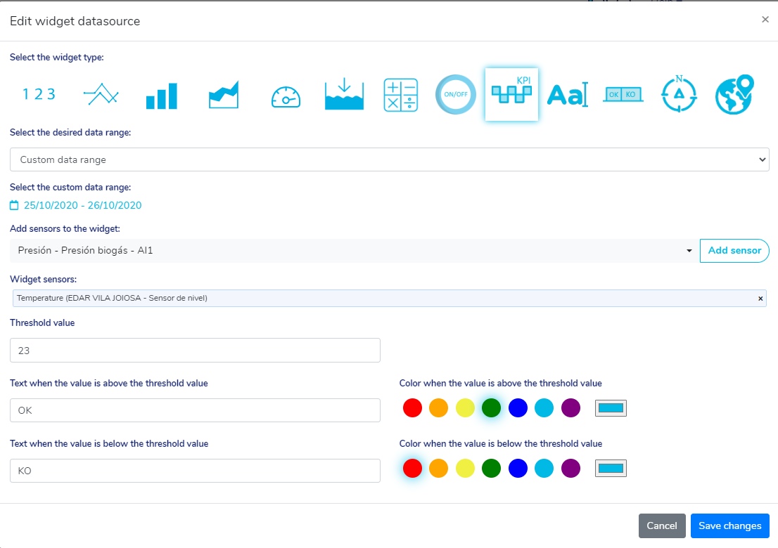
Widget: KPIs
The KPIs widget allows us to set a limit and given this limit, quickly see in a graph the time intervals in which the sensor reports values higher than the limit and the time intervals in which it reports lower values. It also shows us the minimum, maximum and average values of each time interval.
To use this type of widget we must click on:
Once the widget configuration dialog opens, we must choose a sensor, the limit value and the texts and colors to be displayed when the metric is below and above the limit value.
 We can see a use case of this widget in the following image:
Widget: Text
Once the widget configuration panel opens, write the text we want as well as the size, color and font.
Once the configuration is finished, we can edit the size of the widget box at the top right.

Widget: Expert Knowledge
The expert knowledge widget allows us to observe the evolution of states of a sensor over time,
states being the states defined in the expert knowledge configured either by a knowledge template
expert or individually for this sensor only. We can see at every instant of time in which state the sensor was, the value reported by the sensor and we also have the time totals in each state.
To use this type of widget we must click on:
Once the widget configuration dialog opens, we must choose the range of data to be displayed and the sensor.
We can see an example of this widget in the following image:
Widget: Value and direction
The value and direction widget allows us to represent in the same widget the value of a sensor and the direction in which that value is measured. A clear example of use but not limited to this would be to use it to represent the wind speed value given by one sensor and the direction in which this speed given by a different sensor is measured.
To use this type of widget we must click on:
The configuration of this widget will be shown in the window:
In the image above we can see an example of configuration. Three ranges of values 40, 50, and 60 have been created. If we assume that the value sensor returns wind speed in km/h, then if the wind does not exceed 40km/h, the widget will look sky blue. If the wind is between 40 and 50 km / h, it will look yellow, if it is between 50 and 60 orange and for values above 60km / h it will look red.
Widget: Sensor map with expert knowledge
The expert knowledge map widget allows us to see the location, the last value and the status according to expert knowledge for the set of sensors that we select.
To use this widget we must click on:
The configuration window of this widget will be displayed. Next, we must select groups of sensors linked to expert knowledge templates, as seen in the image below:
Once the sensors have been selected, we must link each state of expert knowledge with three colors: red, yellow and green. This allows the map to group sensors by these three colors, show the groups of sensors that are in each color, and also filter by colors.
We can change the name of the state associated with each of the three colors by clicking on the corresponding pencil.
We can filter by sensor type:
We can also filter by the states we have associated in the widget settings:
Move/edit/delete widgets
All widgets once created can be edited/deleted. These actions are done using the icons located in the upper right corner of the widget, as shown in the following image:

By clicking on button number 1 (look at the numbers in the image above), you can specify the height and width of the widget. By clicking on the number 2 button you can configure the widget data source. By clicking on button number 3 you can remove the widget.
- Widgets can be customized in the following ways:
- Move along the panel: Widgets can be moved by dragging them by clicking the mouse at the top gray.
- Edit your title: Clicking on the pencil that will appear when hovering over the current title.
- Edit its size: Using the icon that represents four arrows.
- Edit data source settings: Using the gear icon.
- Delete the widget: Using the trash can icon.